Sustayable
Project background
With an increasing global awareness of climate change and environmental sustainability, there is a demand for travel options that have the least environmental impact. However, planning to travel sustainably can be complex.
Tourism and travel have a real environmental cost, from the carbon footprint of air travel to the strain on natural ecosystems and biodiversity. Its impact on local communities can cut both ways - responsible travellers who support local businesses and respect indigenous cultures leave a positive mark, while exploitative tourism does the opposite.
Brief
Create a user-friendly digital platform that helps users plan sustainable travel, focusing on low-impact transport, eco-friendly accommodation, and sustainable activities.
Role
Researcher
Interview moderator
Workshop facilitator
Usability testing planner & moderator
UX/UI Designer
Team
Susanne Siljeland
Malte Gustavsson
Filippa Hugert (me)
Time duration
Dec 10 2024 - Feb 8 2025 | 10 Weeks
Process
All steps during this project followed the Design Thinking process.
Challenge
The environmental impact of travel is no secret, and there's no shortage of apps, websites, and carbon calculators already attempting to address it. But most of these so-called solutions share a common flaw: they place the burden entirely on the user. They ask travelers to calculate their own footprint, digest lengthy tips, and ultimately figure it out themselves. That's not a solution, it's homework.
The real challenge was to design something that actually works for the user. A solution that removes the friction from sustainable travel by doing the heavy lifting for them - curating real, ready-to-book eco-friendly travel and accommodation packages. Rather than nudging people toward better choices, Sustayable makes the sustainable choice the easy choice.
Concept
The Sustayable app's concept Travel and Stay Sustainable, encourages staycation by providing users with eco-friendly travel and accommodation packages locally in Sweden. It offers inspirational trip recommendations and serves as a pilot that can be adapted for any country.
Empathise.
Research
In order to get answers to our research goals (5W & H), we conducted literature reviews and three one-on-one interviews with participants within the profile.
For synthesising and analysing all the data, we collected everything in a spreadsheet, making themes of all the findings further in the process.
Research goals
Who are the key demographics for sustainable travel, e.g, age, income, values?
What are the biggest challenges travellers face when trying to plan sustainable trips?
Where do users feel they need the most guidance or support in their travel journey, e.g, planning, booking, or on the trip?
When do users decide on sustainable travel as their preferred option, e.g., at the start of planning or when booking?
Why do some travellers prioritise sustainability while others do not?
How can we make sustainable travel planning more attractive, eg, accessible, convenient, effortless, and affordable?
Organising the data
By using a well-organised spreadsheet, we could easily document our research data. This also reduces errors and speeds up the analysis process.
Affinity Mapping
After collecting data, we used Affinity Mapping to categorise findings. This process involved grouping related insights to identify patterns, recurring themes and underlying motivations. By clustering related facts, we were able to pinpoint factors influencing sustainable travel choices.

Key Findings
Users struggle to identify sustainable travel options easily.
Sustainable travel is often perceived as expensive and inconvenient.
Many users would choose sustainable options if they were clearly presented and financially viable.
There is a lack of centralised, user-friendly platforms that integrate all sustainable travel options.
Some users prioritise speed and comfort over sustainability.
Define.
Persona & User Scenario
To make sure every design decision was rooted in reality, we developed a persona and a user scenario based on actual user needs.
PersonaUser ScenarioProblem Statement
“Travellers seeking sustainable alternatives face a lack of viable options and coordinated information to minimise their environmental footprint when planning and booking trips, posing a critical challenge to preserve the planet's current state.”
How might we-questions
How might we attract people to travel more sustainably?
How might we make sustainable travel the default option?
How might we avoid greenwashing?
Ideate.
Brainstorming & NUF-test
Having brainstormed several ideas as a group, we needed to test which idea to develop further by conducting a NUF-test. It resulted in combining two ideas into one - Inspirational staycation packages with an effective transport planner that gives the user sustainable alternatives straight away. The USP (Unique Selling Point) displays attractive graphics showing visual comparisons on environmental impact.
Information Architecture Diagram (IA)
Sketching out the app’s content in an IA ensures the structure is airtight - improving navigation and making the app scalable.
User flow
This user flow depicts pathways users might take when completing a task. From the entry point to the finishing line. This laid as a base for upcoming sketches, wireframing and testing.
Task flow
This task flow shows all the key screens and touchpoints the user will take in the usability test. It’s a simple yet valuable way to determine what screens need to be designed before entering the wireframing and testing phase.
Sketches
First draft of the app’s look and structure. The aim was to create a product that was engaging and memorable. In order to do that, we had Norman’s 3 levels of emotional design top of mind when we started our sketches. By doing so, we ensure that the design are user centric.
Visceral
Attractiveness - should be irresistible to use.
Initial impression - feels like "how great that everything is gathered in one place" being able to plan a sustainable trip easily. Becomes "eager for a weekend getaway".
Feelings - enjoyable, feels exciting "looking forward to a staycation".
Behavioural
Usability - easy to digest information, visual comparisons on environmental impact.
Product function - gathered in one place, travel sustainably, get inspired to experience locally, overview.
Performance - within the app the user can meet their goal fast.
Effectiveness of use - easy to use for both experienced and inexperienced travellers.
Reflective
Meaning of product - can provide added value that makes users return to the app, appeals to their self-image such as nature lover, thinks about the climate, contributes to the cause.
Impact of thought - helps to reduce emissions and strengthens the local economy.
Sharing the experience - when the experience is good, it is easy to spread further.
Cultural meaning - Supports communities, local and cultural initiatives and businesses.
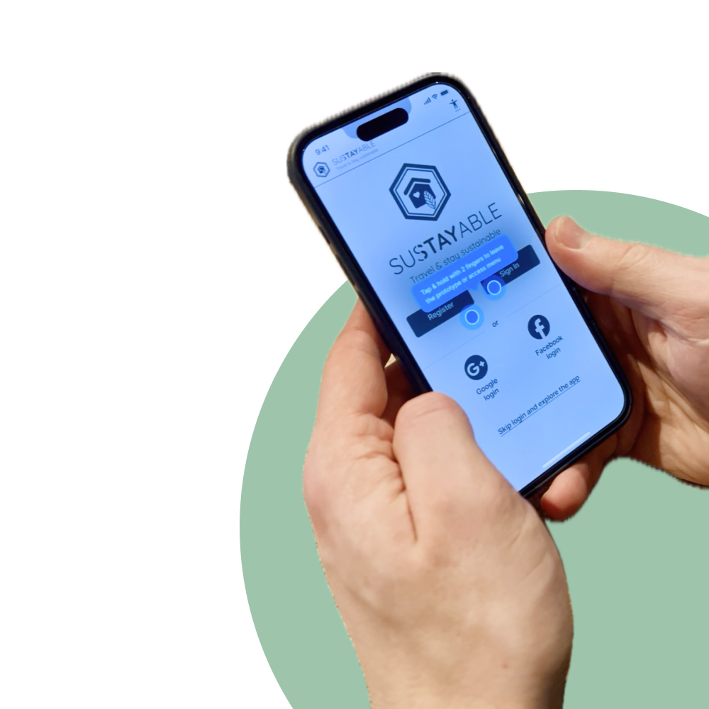
Prototype.
Mid-fi wireframes
Key pages were designed as an MVP (minimum viable product) for the upcoming test.
Test.
Usability testing
After defining all goals, tasks, metrics and a scenario, we recruited three participants for the qualitative, moderated test.
NAVIGATION
Will the navigation work as expected?
FEATURES
Are there any features missing in the app?
OVERALL EXPERIENCE
Will the users be satisfied with the overall experience?
Tasks
Open the app
Find Travel Inspiration
Filter by the following themes: wildlife, nature, idyllic and off-the-grid
Explore “Cabin by the Lake”
See booking details
Save the journey to your favourites
Create an account
Metrics
Success rate evaluates whether the user was able to complete a task within the given scenario.
Errors that prevent the user from completing a task.
Subjective measures establish the user’s level of satisfaction with the experience.
Scenario
You have downloaded and opened the app for the first time. You don’t feel like creating an account at the moment; you just want to explore it as a first step.
You explore the homepage and notice a section with curated travel ideas. You would like to try out the “Inspiration” section.
Using the app’s filter feature, you select the themes wildlife, nature, idyllic, and off-the-grid to narrow down options.
A list of matching trips appears, showcasing destinations that align with your interests.
One option, “Cabin by the lake”, catches your attention. You tap it to get more detailed information about the trip, such as transport options, environmental impact, and estimated cost.
You now want to generate the booking details.
You love the idea of a secluded cabin retreat and decide to add it to your favourites.
To finalise adding the trip to your favourites, you are prompted to create an account.
You select the email option, and your account is now successfully created.
After signing up, you can see that “Cabin by the lake” has been saved to your favourites and can easily get access to it under the tab “Favourites”.
Key Findings
– Usability: UX Copy & Content
Unclear CTAs need refinement. The carbon emission graphics in the Booking section feel repetitive and take up too much space.
– Improvements: “Nice-to-haves”
Users expressed interest in adding reviews to destinations and theme packages.
Better integration of theme icons could make selection easier.
A booking checklist would also improve the user experience.
– Feature design: Filter
The filter function needs improvement, with additional options like “region,” “area,” and “transport options” being highly desired.
Design recommendations
The following recommendations were made to improve the design, ensuring the app meets user expectations effectively.