Examination Project - Animech
Overview.
My six-week-long examination project where I, along with my team successfully did a full new brand platform and visual identity for the Swedish company Animech. I was responsible for redesigning the website and implementing the new visual identity to it.
We presented three visual tracks for the client to choose from. Below follows my work on the one they chose to implement.
See their updated website based on our work:
Role.
Client.
Animech
UX/UI Designer
Team.
Sara Abdirisak | Project Leader
Livia Cives | Communication Designer
Nicolas Lindberg | Art Director
Clara Henning | Public Relations
Carolina Martarelli | Strategic Communication
Marcus Robles | Growth Marketing
Time duration.
Six weeks, Apr 11 2022 - May 20 2022
Mentor.
Sophia Wood | Creative Director | Sophia Wood Studio
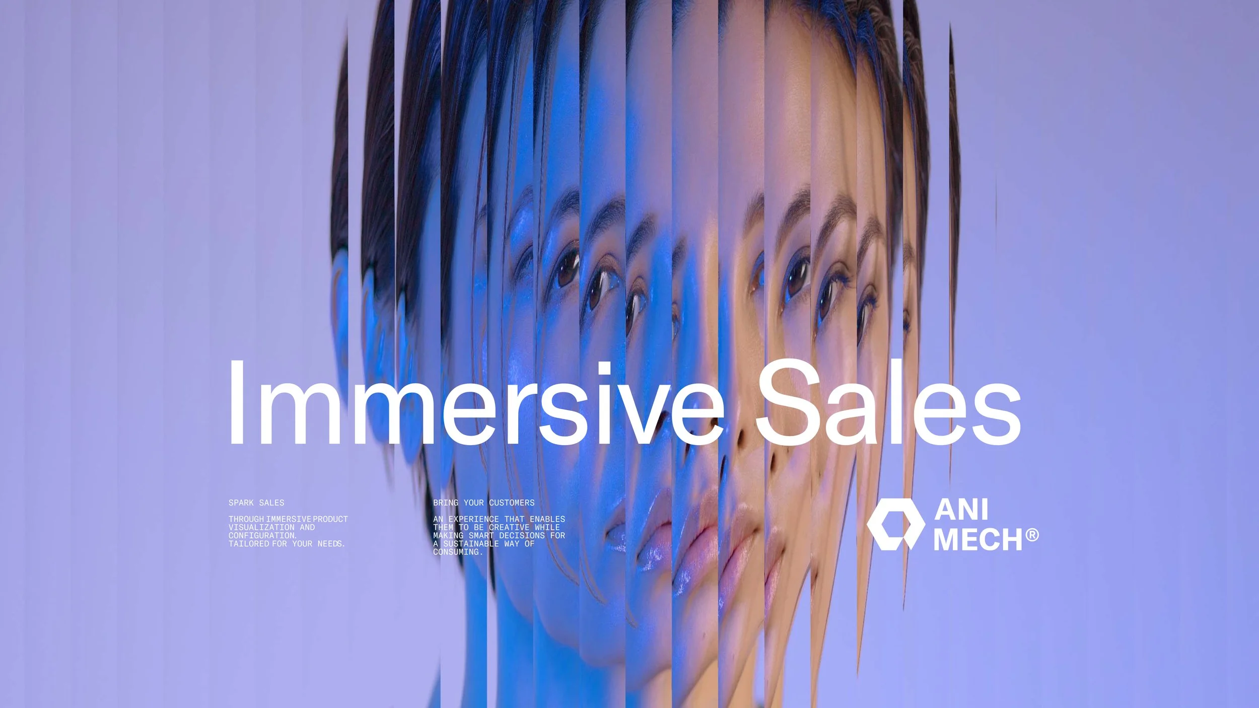
Our concept.
ANIMECH
Animech helps consumers make smarter decisions while e-shopping.
CHALLENGE
Animech offers an opportunity for online consumers to really experience the product before actually making the purchase. In other words, helping consumers make smarter decisions while also offering them a better shopping experience, and at the same time helping fight overconsumption. The task received from Animech was to create a new visual identity and rebuild their brand, focusing on adding a more emotional and human-centered expression.
SOLUTION
In today’s society, we love buying new things, so much in fact it’s become a global problem. Worsening our personal economy and our planet, by filling our bodies with instant satisfaction which also often leads to many of our purchases not being well thought out. Besides this, with a shortening attention span, the infinitely huge internet makes it hard to keep users engaged on companies’ websites.
We want the Animech’s end users to take a step back and enjoy the shopping experience and not only focus on the call to action. To play around and try different options, which will hopefully enable the consumer to have a better shopping experience and make smarter decisions. This is the main purpose of our solution for Animech – Immersive Sales.
RESULT
The solution contains a new brand platform, more specifically a communication- and growth strategy, an updated graphic profile, and UX & UI mockups of the website.
As for Animech themselves, the new identity offers a common ground within the company that resonates with the people working there. Their passion for innovation, play, and creating kickass software.

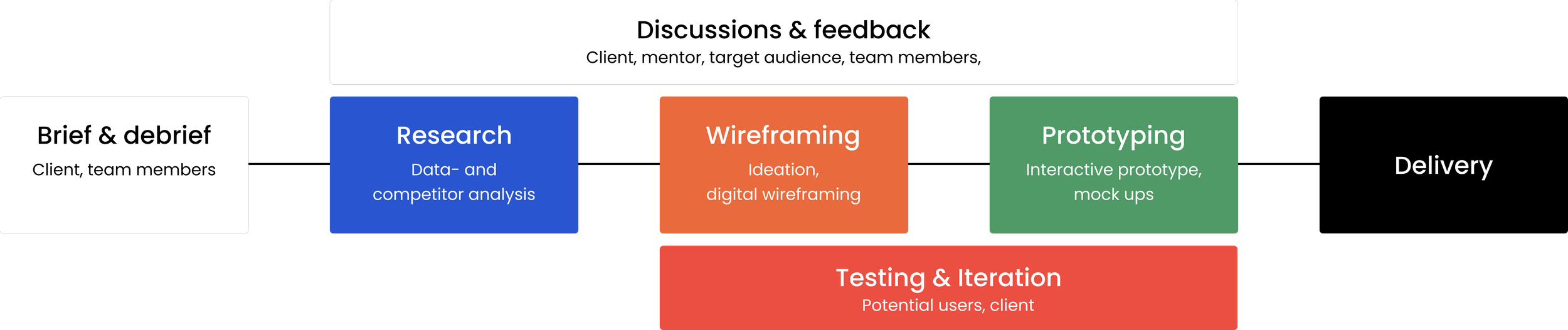
Process.
Exploring the problem.
I started by looking at Animechs data from Google Analytics where I learned that the dropout rate from the homepage was nearly 90%. Why is that? When doing my research and competitors analysis I discovered many had too advanced language - very techy and too many details displayed at once, including Animech. My key insights:
Initially hard to understand the offer - users needed to read a lot of text to understand what Animech offer
Too advanced language - The UX writing was limited and speaking only to tech-people
Many different offers - displayed at onceToo many options and CTAs - there are many buttons on the same pages and inconsistent button language
Confusing to book a meeting - too many clicks away to get in touch with the company
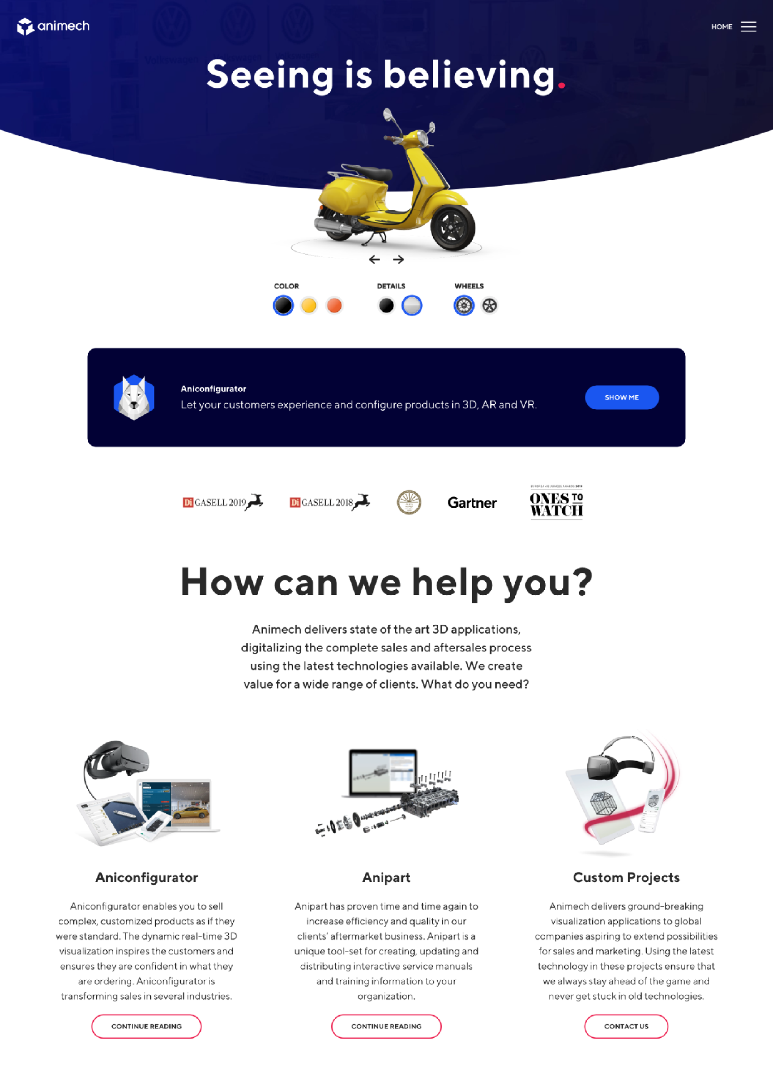
Animech’s previous website
My design.
Rewrite headlines and the most crucial text content for better clarity.
Showcase what the configurator can do more explicitly, to get a better understanding of the product.
Strengthen company values and display customer quotes to increase trust.
When designing the website, I focused on the following areas:
See Animech’s updated website: Animech
Final thoughts.
It was tricky to communicate such a complex product. My goal was to make sure non-tech customers would understand Animechs offers just like a true tech nerd. In the end, I believe I managed to solve it effectively by writing more clear copy with an easygoing tone, and by displaying the configurator tool more upfront.
It was challenging and fun working with combining monotonous & highly contrasted color palettes and at the same time making the overall presentation coherent without too much cognitive overload. I learned a lot from this experience, if I would work with this case again, I would explore using the highly contrasting colors more to my advantage.